The BCC
| Sector: | Sport / Cycling |
|---|---|
| Collateral: | Identity, apparel & website |
| Visit: | beckenhamcyclingclub.co.uk |
All designers should have a not-for-profit side project...
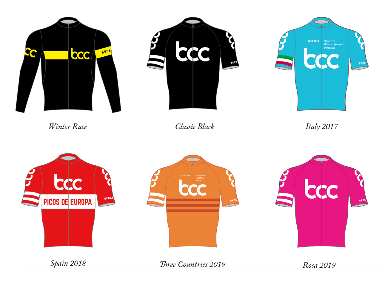
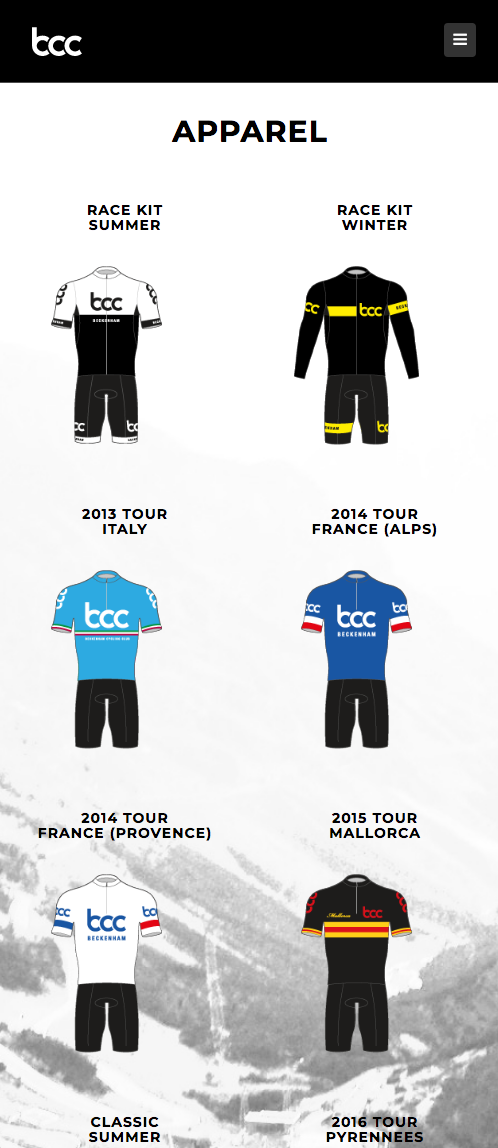
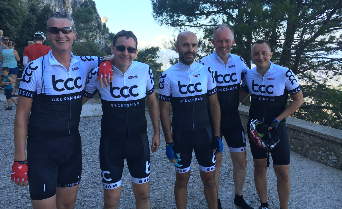
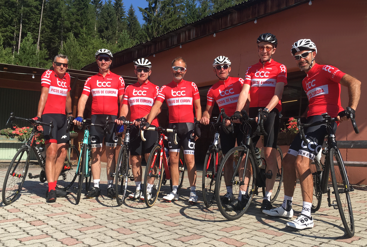
...and this is mine. It's a happy coincidence that cycling also happens to be a big part of my life. Our local CC needed a distinct identity to protect the name and provide a cohesive, stylish team ride. Colour and design in cycling is a complex area to negotiate, you have to balance overall visbility for rider safety against maintaining brand identity, all the while ensuring you don't trip up any colour conventions within cycling (grand tour leader's jerseys, national champion colours and other CCs).
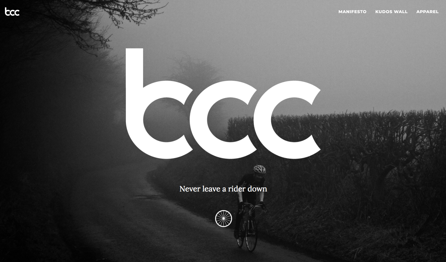
The modern wordmark, hand drawn and intended to describe a group of wheels riding in line, is paired up with a vintage feeling condensed, heavily tracked Helvetica.
